Engineered for Your Industry
We enable GPT—growth, productivity, and transformation— through smarter software delivery, intelligent solutions, and an AI-ready workforce.
Seamless Journeys for Lasting Impact
Explore


Intelligent Realty Solutions
Explore


-1771562959430.jpeg)
Technology Impact Across Verticals
Explore


Pharmaceutical and Healthcare Solutions
Explore


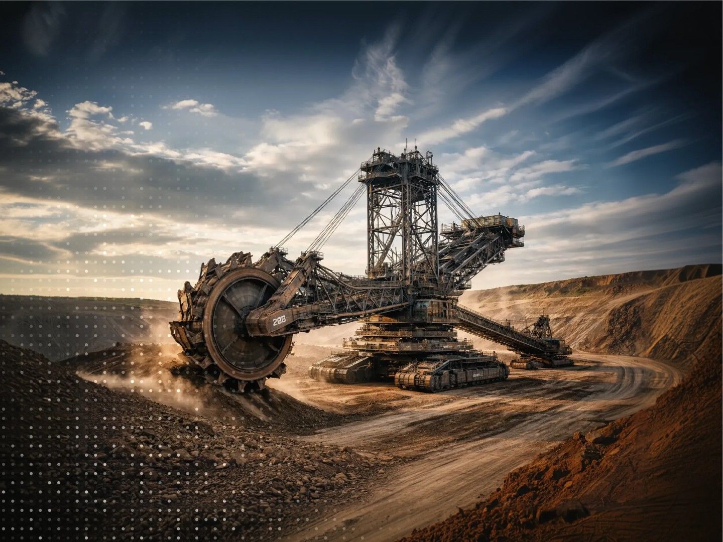
Digital Transformation in Manufacturing
Explore


Our Journey, Your Advantage
Growing and succeeding with our clients. Every milestone in our journey reflects our commitment to accelerating client growth and transformation.
0+
Active Clients
0+
Projects Delivered
0
Global Locations
0
Years of Innovation
0+
Skilled Workforce
Solutions for Accelerated Transformations

Digital Experience
Delivering experiences engineered to precision. We create seamless digital experiences that ensure every human-machine interaction unlocks new value.
Delivering experiences engineered to precision. We create seamless digital experiences that ensure every human-machine interaction unlocks new value.
Explore
Intelligent Enterprises
Enabling a smarter version of your organization. We deliver AI and data-driven solutions for informed decisions and operational excellence.
Enabling a smarter version of your organization. We deliver AI and data-driven solutions for informed decisions and operational excellence.
Explore
Product Engineering
Engineering intelligence to accelerate product journeys for digital innovators. We build your digital systems with speed through High AI-Q.
Engineering intelligence to accelerate product journeys for digital innovators. We build your digital systems with speed through High AI-Q.
Explore

Managed Agents
Orchestrating intelligent systems at scale. We build, deploy, and manage AI agents that automate workflows, streamline operations, and drive efficiency.
Orchestrating intelligent systems at scale. We build, deploy, and manage AI agents that automate workflows, streamline operations, and drive efficiency.
Explore

Modernization
Equipping your enterprise for an AI-first world with agility and operational efficiency through the digital transformation of your legacy systems.
Equipping your enterprise for an AI-first world with agility and operational efficiency through the digital transformation of your legacy systems.
Explore


-1772517801213.jpg)